Rohit Gupta
Merced Weather Analysis
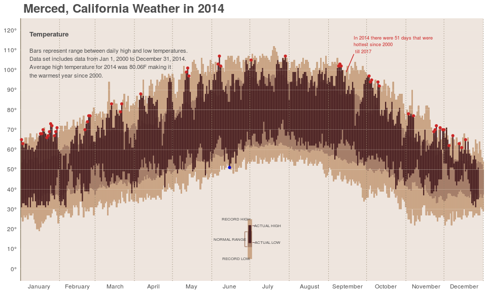
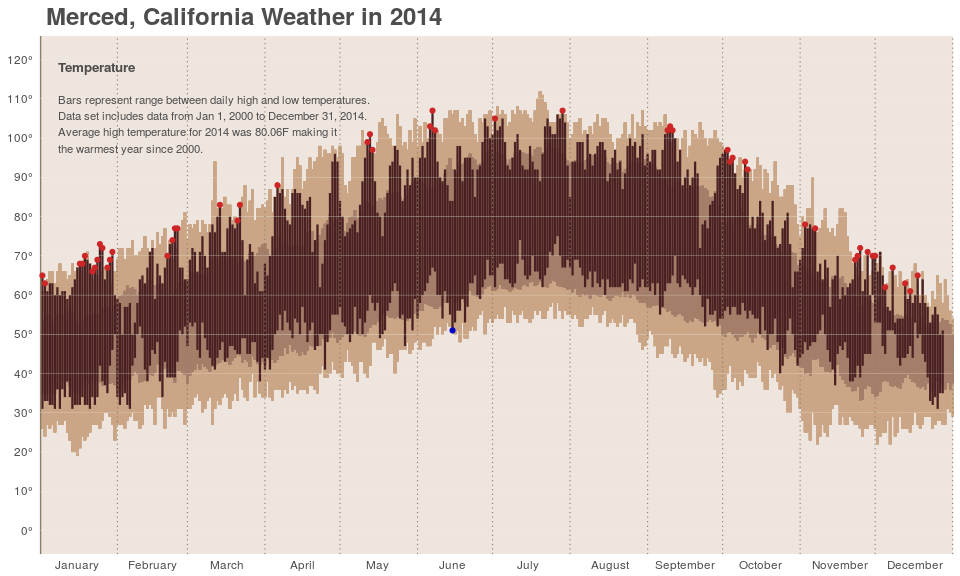
In the data visualization community Edward Tufte’s chart of New York City 2003 weather is well-known, Brad Boehmke published a blogpost with a similar chart for his city, Dayton, titled Dayton’s weather in 2014 which inspired me to do a similar visualization for my city, Merced, California. The result is the chart below. The R code to build the chart is located here and it draws from Boehmke’s post but also includes original code. Further below I describe the steps used to arrive at the chart.

I started by searching the NCDC (National Climatic Data Center) website for Merced weather data. Luckily, data was available for Merced Municipal Airport. I obtained that data from NCDC for the most recent 17-year period (January 01, 2000 through March 15, 2017) and used it as the raw data for this project. This data is hereafter referred to as Merced weather data.
Unlike Tufte’s original chart (shown below) which included graphics for Temperature and Precipitation, I decided to include only Temperature in my chart. I will include Merced precipatation data in a future update to this post.

Code for data analysis
library(dplyr)
library(ggplot2)
library(grid)
# Load 15 year data from Merced Weather station of NCDC into R
merced_data <- read.csv("920902.csv", stringsAsFactors = FALSE, sep=",")

# Convert all column names into lowercase (for convenience)
colnames(merced_data) <- tolower(names(merced_data))

# Create a dataframe containing data related only to temperature measurements; ignore other data

only_temps <- merced_data %>%
                 select(date, tmax, measurement.flag.7,
                 quality.flag.7, source.flag.7,tmin, measurement.flag.8,
                 quality.flag.8, source.flag.8)


# Convert date into three columns - year, month, day
# The date in the raw data file is a string in the format YYYYMMDD

# First convert String object to class "Date"
all_dates <- as.Date(as.character(only_temps$date),
                      format="%Y%m%d", origin="1970-01-01")

# Extract parts of the date and make three columns
all_dates <- as.POSIXlt(all_dates)
#POSIXlt object is a list of date parts

year <- all_dates$year + 1900
# years is num of years from 1900, therefore adding 1900

month <- all_dates$mon
day <- all_dates$mday

# Replace the date column with 'split' date part columns (i.e., year, month, day columns)
only_temps <- subset(only_temps, select=-date)
#dropping date column}

only_temps <- cbind(year, month, day, only_temps)
#adding back the split column data}


# Save the data into a file. Data in this file will be used for visualization
write.csv(only_temps, file="merced_15yr_temp.csv",row.names=FALSE)
Moving on to data preperation for actual analysis.
only_temps <- read.csv("merced_15yr_temp.csv", stringsAsFactors = FALSE, sep = ",")

## Clean the data: drop records with invalid temp values, and missing or invalid
## measurement, quality or source flags

temp_15 <- only_temps %>%
         filter(tmax != -9999 &
         # drop missing max temp identified by -9999
         tmin != -9999 & # drop missing min temp identified by -9999
         source.flag.7 != " " & # drop tmax data with no source (blank)
         !is.na(source.flag.7) & #  or NA
         source.flag.8 != " " & # drop tmin data with no source (blank)
         is.na(source.flag.8)) #  or NA

# 6128/6282
154 rows of data were dropper from original dataset.Next I computed the average max and average min temperature for each year to see how Merced fared in 2014 relative to the previous 14 years.
# Compute the average per year min and max temps
    average_temp <- temp_15 %>%
         group_by(year) %>%
         summarise(avg_min = mean(tmin),
                   avg_max = mean(tmax)) %>%
         ungroup()
Sorting the average yearly temperatures yielded an interesting result: 2014 was the warmest of the past 15 years! In a recent in January NASA and NOAA found that 2014 was the warmest year in modern record, and the above results for Dublin temperatures align with that finding.
    head(arrange(average_temp, desc(avg_min)))

    ## # A tibble: 6 × 3
    ##    year  avg_min  avg_max
    ##   <int>    <dbl>    <dbl>
    ## 1  2014 51.79778 80.06094
    ## 2  2015 49.82123 77.45251
    ## 3  2012 49.71519 78.08861
    ## 4  2016 49.41484 77.23626
    ## 5  2005 49.35635 75.28453
    ## 6  2004 48.67867 75.22715
    head(arrange(average_temp, desc(avg_max)))

    ## # A tibble: 6 × 3
    ##    year  avg_min  avg_max
    ##   <int>    <dbl>    <dbl>
    ## 1  2014 51.79778 80.06094
    ## 2  2012 49.71519 78.08861
    ## 3  2013 48.55120 77.94880
    ## 4  2015 49.82123 77.45251
    ## 5  2016 49.41484 77.23626
    ## 6  2008 48.62192 76.76986
Create a dataframe that represents 17 years of historical temp data from 2000-2017
past <- temp_15 %>%
          group_by(year) %>%
          arrange(month, day) %>%
          ungroup() %>%
          group_by(year) %>%
          mutate(newDay = seq(1, length(day))) %>%
          ungroup() %>%
          filter(!year %in% c("2017","2016")) %>%
          group_by(newDay) %>%
          mutate(upper = max(tmax),
                lower = min(tmin),
                avg_upper = mean(tmax),
                avg_lower = mean(tmin)) %>%
          ungroup()

past_2014 <- temp_15 %>%
          group_by(year) %>%
          arrange(month, day) %>%
          ungroup() %>%
          group_by(year) %>%
          mutate(newDay = seq(1, length(day))) %>%
          ungroup() %>%
          filter(year != 2014) %>%
          filter(tmin != 0) %>%
          group_by(newDay) %>%
          mutate(upper = max(tmax),
                 lower = min(tmin),
                 avg_upper = mean(tmax),
                 avg_lower = mean(tmin)) %>%
          ungroup()

present <- temp_15 %>%
          group_by(year) %>%
          arrange(month, day) %>%
          ungroup() %>%
          group_by(year) %>%
          mutate(newDay = seq(1, length(day))) %>%
          ungroup() %>%
          filter(year %in% "2016")

          #I have another dataframe for 2017.

temp_2017 <- temp_15 %>%
          group_by(year) %>%
          arrange(month, day) %>%
          ungroup() %>%
          group_by(year) %>%
          mutate(newDay = seq(1, length(day))) %>%
          ungroup() %>%
          filter(year %in% "2017")

only_2014 <- temp_15 %>%
          group_by(year) %>%
          arrange(month, day) %>%
          ungroup() %>%
          group_by(year) %>%
          mutate(newDay = seq(1, length(day))) %>%
          ungroup() %>%
          filter(year == 2014)
Create dataframe that represents the lowest same-day temperature from years 2000-2017
low_temps <- past_2014 %>%
         group_by(newDay) %>%
         summarise(pastlow = min(tmin)) # to identify same day lowest temperatures
	head(arrange(low_temps, pastlow))

    ## # A tibble: 6 × 2
    ##   newDay pastlow
    ##    <int>   <int>
    ## 1     15      19
    ## 2     13      20
    ## 3     14      20
    ## 4     16      21
    ## 5    311      22
    ## 6    335      22
Since 1 January 2000 , 15 January 2007 has been the coldest day in Merced with a minimum recorded temperature of 19 F, followed by January 13, 14 and 16th of same month and year. Overall, January has been the coldest month in Merced with a mean minimum temperature of 25.4 F (ignoring January 2014), the average daily high was 55.24 and daily low of 36.87 (since Jan 1, 2000).
high_temp <- past_2014 %>%
    group_by(newDay) %>%
    # to identify same day highest temperatures minus highs of 2014
    summarise(pasthigh = max(tmax))
    head(arrange(high_temp, desc(pasthigh)))

    ## # A tibble: 6 × 2
    ##   newDay pasthigh
    ##    <int>    <int>
    ## 1    200      112
    ## 2    201      111
    ## 3    199      110
    ## 4    202      109
    ## 5    183      108
    ## 6    191      108
# To identify exactly how hot 2014 was, I compared maximum recorded temperatures against tmax in 2014.
    low_2014 <- only_2014 %>%
         left_join(low_temps) %>%
         mutate(record = ifelse(tmin<pastlow, "Y", "N")) %>%
         filter(record == "Y")

    high_2014 <- only_2014 %>%
        left_join(high_temp)%>%
        mutate(record = ifelse(tmax>pasthigh, "Y", "N")) %>%
       filter(record =="Y")
Lets look at 2016 and 2017 data now, I am going to check if 2016 and 2017 were warmer or colder when compared with 2000-2015.
lows <- past %>% #low temperature from all years before 2016
             group_by(newDay) %>%
             summarise(Pastlow = min(tmin))

highs <- past %>%
             group_by(newDay) %>% #hightemperature from all years before 2016
             summarise(Pastlow = max(tmax))

low_2016 <- present %>%
         left_join(lows) %>%
         mutate(record = ifelse(tmin<Pastlow, "Y", "N")) %>%
         filter(record == "Y")

high_2016 <- present %>%
          left_join(highs) %>%
          mutate(record = ifelse(tmax>Pastlow, "Y", "N")) %>%
          filter(record == "Y")

low_3month <- past %>%
         filter(month %in% c("0", "1", "2")) %>%
          filter(year != 2017) %>%
          group_by(newDay) %>%
          filter(!newDay %in% c("76", "77","78","79","80","81",
          "82","83","84","85","86","87","88","89","90")) %>%
          summarise(low = min(tmin))

high_3month <- past %>%
         filter(month %in% c("0", "1", "2")) %>%
          filter(year != 2017) %>%
          group_by(newDay) %>%
          filter(!newDay %in% c("76", "77","78","79","80","81",
          "82","83","84","85","86","87","88","89","90")) %>%
          summarise(high = max(tmax))

low_2017 <- temp_2017 %>%
         left_join(low_3month) %>%
         mutate(record = ifelse(tmin<low, "Y", "N")) %>%
         filter(record =="Y")

high_2017 <- temp_2017 %>%
         left_join(high_3month) %>%
         mutate(record = ifelse(tmax>high, "Y", "N")) %>%
         filter(record =="Y")
There have been 4 days in 2017 where minimum recorded temperature has been lowest since 2000, however there have been 0 days with recorded maximum temperture higher than any year from 2000 onwards. As for 2016, there were 26 days where recoded maximum temperature was higher than any previous year since 2000(including 2014), and there were 12 days where recorded minimum temperature was lower than any year since 2000, mean recorded maximum temperature in 2016 was 77.23626 and mean recorded low temperature was 49.41484 but for years before 2016 (including 2014!) mean highest temperature was 76.045 and mean lowest temperature was 48.59167.
Overall, 2017 has not been a very cold year so far, daily average high temperature of first 75 days of 2017 was 60.05333 and average low temprature was 40.44, while average low temperture for first 75 days of the year since 2000 was 60.27294 and average high was 38.95137.
At this point all data required to create the chart was available. We already had the x-axis variable but the y-axis variable needed to be created. Also, the y-axis values needed to show the degree symbol, which I created as follows.
    degree_format <- function(x, ...)
       parse(text = paste(x, "*degree", sep=""))

    yaxis_temps <- degree_format(seq(0, 120, by=10))
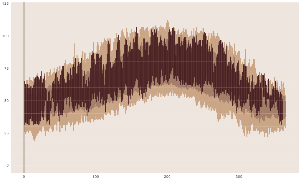
The stage was now set to actually create the chart using ggplot2. The chart was created in a series of steps adding layers at each step. Since I followed the steps in Boehmke’s post I will not go into details except for short descriptions.
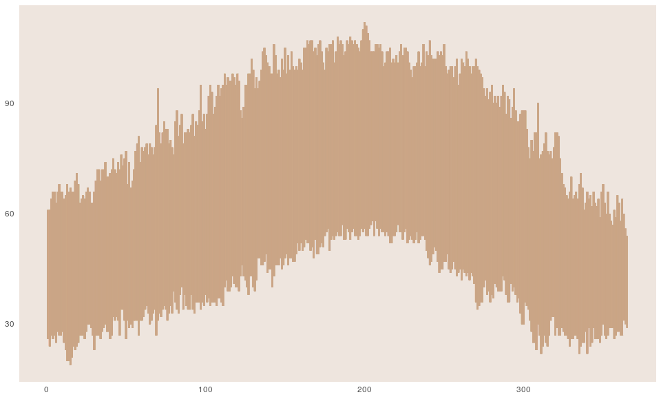
Step 1: Create the canvas for the plot and show the 14-year record highs and lows as the broad background
    library(ggplot2)
    # Step 1: create the canvas for the plot. Also plot the background lowest, highest temps
    p <- ggplot(past_2014, aes(newDay, tmax)) +
            theme(plot.background = element_blank(),panel.grid.minor = element_blank(),
                  panel.grid.major = element_blank(),panel.border = element_blank(),
                  panel.background = element_rect(fill ="seashell2"),
                  axis.ticks = element_blank(),#axis.text = element_blank(),
                  axis.title = element_blank()) +
            geom_linerange(past_2014,mapping=aes(x=newDay, ymin=lower,ymax=upper),
            			   size=0.9, colour = "#CAA586", alpha=.6)
    print(p)
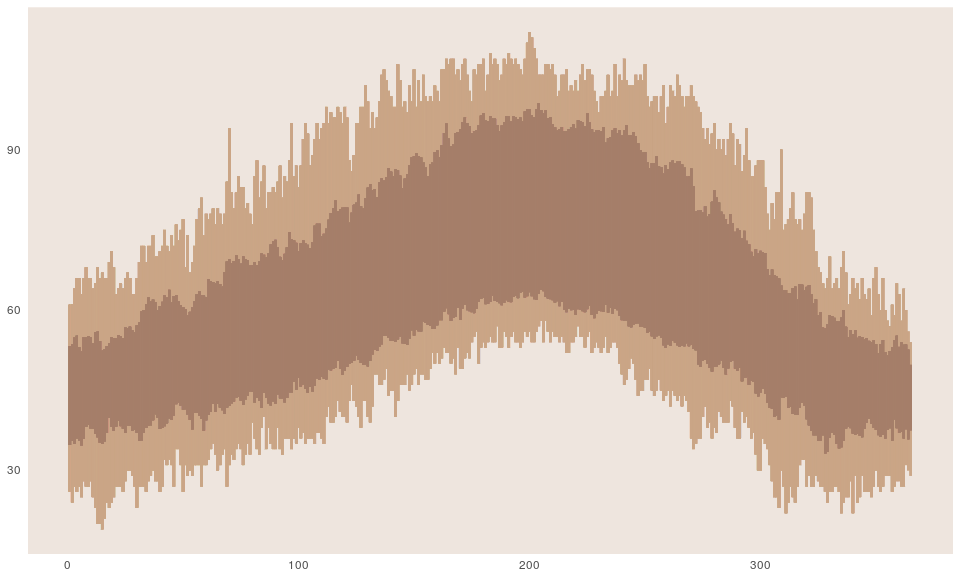
Step 2: Add the average daily temperatures since 2000.
    p <- p +
            geom_linerange(past_2014,mapping=aes(x=newDay,ymin=avg_lower, ymax=avg_upper),
                           size=0.8,colour = "#A57E69")
    print(p)
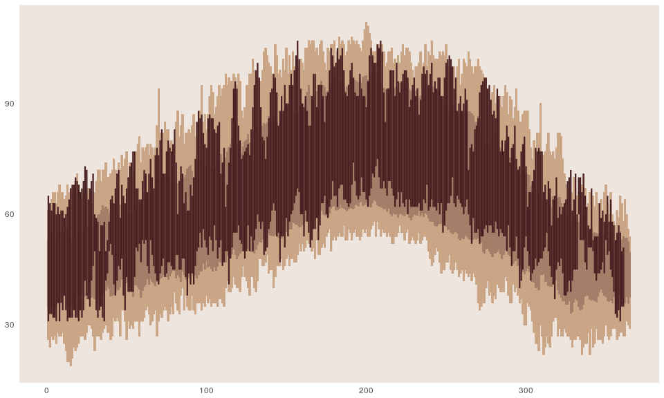
Step 3: Finally adding 2014 tempratures.
    # Step 3: Plot 2014 high and low temps
    p <- p +
            geom_linerange(only_2014,mapping=aes(x=newDay, ymin=tmin, ymax=tmax),
            			   size=0.8, colour = "#4A2123")
    print(p)
Step 4: Add y-axis border and x-axis gridlines
    p <- p +
            geom_vline(xintercept = 0, colour = "wheat4",linetype=1, size=1) +
            geom_hline(yintercept = 0, colour = "ivory2",linetype=1, size=.1) +
            geom_hline(yintercept = 10, colour = "ivory2",linetype=1, size=.1) +
            geom_hline(yintercept = 20, colour = "ivory2",linetype=1, size=.1) +
            geom_hline(yintercept = 30, colour = "ivory2",linetype=1, size=.1) +
            geom_hline(yintercept = 40, colour = "ivory2",linetype=1, size=.1) +
            geom_hline(yintercept = 50, colour = "ivory2",linetype=1, size=.1) +
            geom_hline(yintercept = 60, colour = "ivory2",linetype=1, size=.1) +
            geom_hline(yintercept = 70, colour = "ivory2",linetype=1, size=.1) +
            geom_hline(yintercept = 80, colour = "ivory2",linetype=1, size=.1) +
            geom_hline(yintercept = 90, colour = "ivory2",linetype=1, size=.1) +
            geom_hline(yintercept = 100, colour = "ivory2",linetype=1, size=.1) +
            geom_hline(yintercept = 110, colour = "ivory2",linetype=1, size=.1) +
            geom_hline(yintercept = 120, colour = "ivory2",linetype=1, size=.1)
    print(p)
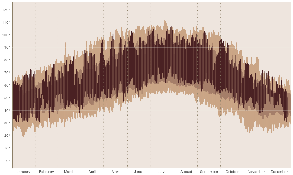
Step 5 & 6: Add vertical gridlines to mark each month and add labels to the x and y axes.
    # Step 5: Add vertical gridlines to mark end of each month
    p <- p +
            geom_vline(xintercept = 31, colour = "wheat4",linetype=3, size=.4) +
            geom_vline(xintercept = 59, colour = "wheat4",linetype=3, size=.4) +
            geom_vline(xintercept = 90, colour = "wheat4",linetype=3, size=.4) +
            geom_vline(xintercept = 120, colour = "wheat4",linetype=3, size=.4) +
            geom_vline(xintercept = 151, colour = "wheat4",linetype=3, size=.4) +
            geom_vline(xintercept = 181, colour = "wheat4",linetype=3, size=.4) +
            geom_vline(xintercept = 212, colour = "wheat4",linetype=3, size=.4) +
            geom_vline(xintercept = 243, colour = "wheat4",linetype=3, size=.4) +
            geom_vline(xintercept = 273, colour = "wheat4",linetype=3, size=.4) +
            geom_vline(xintercept = 304, colour = "wheat4",linetype=3, size=.4) +
            geom_vline(xintercept = 334, colour = "wheat4",linetype=3, size=.4) +
            geom_vline(xintercept = 365, colour = "wheat4", linetype=3, size=.4)

    # Step 6: Add labels to the x and y axes
    p <- p +
            coord_cartesian(ylim = c(0,120)) + scale_y_continuous(breaks = seq(0,120, by=10),
            labels = yaxis_temps) +
            scale_x_continuous(expand = c(0, 0),breaks = c(15,45,75,105,135,165,195,
                               228,258,288,320,350),labels = c("January", "February","March", "April",
                               "May", "June", "July","August", "September","October", "November",
                               "December"))
    print(p)
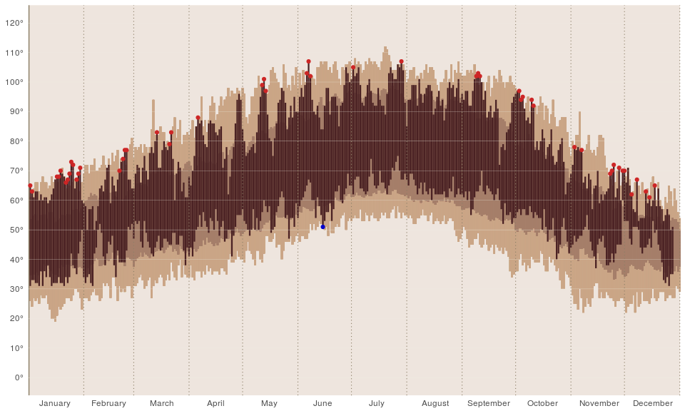
**Step 7**: Mark days with record temperatures. Note that there is just
one record low temperature point in the chart below. That's because
there really was just one record low in 2014 because it was the warmest
year.

    p <- p +
            geom_point(data=low_2014, aes(x=newDay,y=tmin), colour="blue3") +
            geom_point(data=high_2014, aes(x=newDay,y=tmax), colour="firebrick3")
    print(p)
Step 8 & 9 : Add a title to the chart and provide explanation about the data in the top left
    # Step 8: Add title to plot
    p <- p +
            ggtitle("Merced, California Weather in 2014") +
            theme(plot.title=element_text(face="bold",hjust=.012,vjust=.8,colour="gray30",size=18))

    # Step 9: Add explanation text under the plot title
    grob1 = grobTree(textGrob("Temperature\n",x=0.02, y=0.92, hjust=0,gp=gpar(col="gray30", fontsize=10,
                              fontface="bold")))
    p <- p + annotation_custom(grob1)

    grob2 = grobTree(textGrob(paste("Bars represent range between daily high and low temperatures.\n",
    "Data set includes data from Jan 1, 2000 to December 31, 2014.\n", "Average high temperature for 		2014 was 80.06F making it\n","the warmest year since 2000.", sep=""), x=0.02, y=0.83, hjust=0,
                              gp=gpar(col="gray30", fontsize=8.5)))

    p <- p + annotation_custom(grob2)
    print(p)
Step 10 : Add annotation for the record high 2014 temperature points.
    #Step 10: Add annotation for points representing the record high 2014 temperatures

    grob3 = grobTree(textGrob(paste("In 2014 there were 51 days that were \n","hottest since 2000\n till 	 2017",sep=""),x=0.72, y=0.9, hjust=0,gp=gpar(col="firebrick3", fontsize=7)))

    p <- p + annotation_custom(grob3)

    p <- p +
            annotate("segment", x = 257, xend = 263, y = 99, yend = 108, colour = "firebrick3")
    print(p)
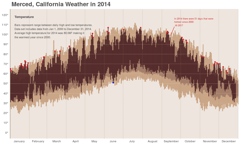
Step 11 : Finally, add legend to explain the three “layers” of data: the background record highs and lows over a 14-year period, the average highs and lows over the same period, and the 2014 daily highs and lows.
    # Step 11: Add legend to explain difference between the different data point layers
    p <- p +
            annotate("segment", x = 181, xend = 181, y = 5, yend = 25, colour = "#CAA586", size=3) +
            annotate("segment", x = 181, xend = 181, y = 11,yend = 19, colour = "#A57E69", size=3) +
            annotate("segment", x = 181, xend = 181, y = 13,yend = 22, colour = "#4A2123", size=2) +
            annotate("segment", x = 177, xend = 179, y = 18.7,yend = 18.7, colour = "#A57E69", size=.5)+
            annotate("segment", x = 177, xend = 179, y = 11.2,yend = 11.2, colour = "#A57E69", size=.5)+
            annotate("segment", x = 177, xend = 177, y = 11.2,yend = 18.7, colour = "#A57E69", size=.5)+
            annotate("segment", x = 183, xend = 185, y = 13.25,yend = 13.25, colour ="#4A2123",size=.3)+
            annotate("segment", x = 183, xend = 185, y = 21.75,yend = 21.75,colour ="#4A2123",size=.3) +
            annotate("text", x = 165, y = 14.75, label = "NORMAL RANGE",size=2.1, colour="gray30") +
            annotate("text", x = 170, y = 25, label = "RECORD HIGH",size=2.1, colour="gray30") +
            annotate("text", x = 170, y = 5, label = "RECORD LOW",size=2.1, colour="gray30") +
            annotate("text", x = 195, y = 21.75, label = "ACTUAL HIGH",size=2.1, colour="gray30") +
            annotate("text", x = 195, y = 13.25, label = "ACTUAL LOW",size=2.1, colour="gray30")

    print(p)