 Rohit Gupta
An ode to joy-plot
At the end of my Shiny app post I left a short to-do list, and the first item was “An ode to joy-plot”. I admitted then that I was mainly doing it for the pun in the title. That is still true, but the plot is useful too, so here it is: ridgeline plots of Merced weather, made with ggplot2 and the ggridges package.
This is the third post in my Merced weather series. The first one was a Tufte-style chart of daily temperatures at Merced Municipal Airport, and the second wrapped that chart in a Shiny app. Both looked at one day at a time. This time I wanted to see the whole distribution of daily highs for each month, stacked so the seasons are easy to compare.
What a ridgeline plot is
A ridgeline plot is a stack of density curves (or histograms), one per group, drawn along a shared x-axis and offset vertically so they partly overlap. Each curve sits on its own baseline, and the overlap is what makes it compact. With twelve months you get twelve little mountain ranges, and you can read the seasonal shift by following the peaks down the page.
It works best when:
- You have many groups. Overlapping density plots are fine for two or three groups. With twelve, you get a tangle of lines and a legend you have to keep looking back at.
- The groups have a natural order. Months, years, age classes, time points in an experiment. The vertical position then carries meaning, and the eye follows the trend from row to row.
- You care about shape and location more than exact values. Ridgelines show where the mass of each distribution is, whether it is skewed, and whether it has two humps. They are not good for reading off precise density values, because the y-axis is just group labels.
Compared with small multiples (facet_wrap() with one density per panel), ridgelines use space much better. Every facet gets its own strip, its own axis and its own padding, and comparing panel 2 with panel 11 means jumping across the grid. A ridgeline puts all of them on one x-axis, close together.
They are a bad choice when you only have a couple of groups (just overlay them), when some groups have very few observations (the density estimate will be mostly invention), or when the overlap is so heavy that tall curves hide shorter ones. More on that last one below.
Why “joy plot”
The name comes from the cover of Joy Division’s 1979 album Unknown Pleasures, designed by Peter Saville. The cover is white lines on black: a stack of successive radio pulses from CP 1919, the first pulsar ever discovered (by Jocelyn Bell Burnell in 1967). It is basically a ridgeline plot, and once people started making these charts in R the nickname stuck. Claus Wilke’s package was first released as ggjoy.
In 2017 Wilke renamed the package to ggridges and switched to “ridgeline plot”. The band’s name refers to the groups of women forced into sexual slavery in Nazi concentration camps, and he did not want that baked into a function name. geom_joy() became geom_density_ridges() and theme_joy() became theme_ridges(). I use “ridgeline” in the code and comments and save “joy” for the title.
Getting the data
For the first post I downloaded a CSV by hand from the NCDC website. This time I wanted something I could re-run from a script, so I used NOAA’s GHCN-Daily dataset, which publishes one CSV per station. Merced Municipal Airport is station USW00023257, and its file lives here:
https://www.ncei.noaa.gov/data/global-historical-climatology-network-daily/access/USW00023257.csv
If you want a local copy:
curl -O https://www.ncei.noaa.gov/data/global-historical-climatology-network-daily/access/USW00023257.csv
head -n 2 USW00023257.csv
The first two lines look like this (one row per day; I trimmed the lines, since there are many more columns):
"STATION","DATE","LATITUDE","LONGITUDE","ELEVATION","NAME","PRCP","PRCP_ATTRIBUTES","SNOW","SNOW_ATTRIBUTES","SNWD","SNWD_ATTRIBUTES","TMAX","TMAX_ATTRIBUTES","TMIN","TMIN_ATTRIBUTES",...
"USW00023257","1998-08-01","37.28597","-120.51788","46.5","MERCED MUNICIPAL AIRPORT, CA US","    0",",,W",,,,,"  339",",,W","  156",",,W",...
A few things about this “access” format that matter for the code:
- The columns depend on the station. There is a value column for every element the station has ever reported (
PRCP,TMAX,TMIN, wind, weather types and so on), each followed by a*_ATTRIBUTEScolumn. Don’t count onTMAXbeing column 13; select it by name. - Temperatures are in tenths of a degree Celsius. That
" 339"is 33.9 °C. The values are also quoted and padded with spaces, so read them as text and convert. - Missing values are empty fields. The older fixed-width GHCN files use
-9999for missing, so I handle both. - The attributes column holds comma-separated flags: measurement flag, quality flag, source flag, and sometimes an observation time. A blank quality flag means the value passed NOAA’s quality checks.
",,W"means no measurement flag, no quality flag, source W.
Here are the packages and the download. read_csv() reads straight from the URL, and I force every column to character so readr doesn’t guess types from the first thousand rows and get them wrong.
library(readr)
library(dplyr)
library(lubridate)
library(ggplot2)
library(ggridges)
library(forcats)

url <- paste0(
  "https://www.ncei.noaa.gov/data/global-historical-climatology-network-daily/",
  "access/USW00023257.csv"
)

raw <- read_csv(url, col_types = cols(.default = col_character()))

# Fail early if NOAA ever changes the layout
needed <- c("DATE", "TMAX")
missing_cols <- setdiff(needed, names(raw))
if (length(missing_cols) > 0) {
  stop("Expected column(s) not found: ", paste(missing_cols, collapse = ", "))
}
if (!"TMAX_ATTRIBUTES" %in% names(raw)) {
  raw$TMAX_ATTRIBUTES <- NA_character_
}
Tidying with dplyr and lubridate
Two small helpers do most of the work. The first turns the padded strings into numbers, sets -9999 to NA, and converts tenths of °C to °F, so the numbers match the earlier posts. The second pulls the quality flag (the second comma-separated field) out of the attributes column.
tenths_c_to_f <- function(x) {
  x <- suppressWarnings(as.numeric(trimws(x)))
  x[x == -9999] <- NA
  (x / 10) * 9 / 5 + 32
}

quality_flag <- function(attr) {
  attr <- ifelse(is.na(attr), "", attr)
  ifelse(grepl(",", attr), sub("^[^,]*,([^,]*).*$", "\\1", attr), "")
}
Then the usual dplyr pipeline. I keep 2000 through 2018, which roughly matches the window in the first post and gives complete calendar years.
merced <- raw %>%
  transmute(
    date   = ymd(DATE),
    tmax_f = tenths_c_to_f(TMAX),
    tmax_q = quality_flag(TMAX_ATTRIBUTES)
  ) %>%
  filter(
    date >= ymd("2000-01-01"),
    date <= ymd("2018-12-31"),
    !is.na(tmax_f),
    tmax_q == ""
  ) %>%
  mutate(
    year  = year(date),
    month = factor(month.name[month(date)], levels = month.name),
    # January on top: ggridges draws the first factor level at the bottom
    month = fct_rev(month)
  )
Compare this with the first post, where I split YYYYMMDD strings by hand with as.POSIXlt() and added 1900 to the year. lubridate’s ymd(), year() and month() do all of that in one line each.
I build the month factor from month.name rather than using month(date, label = TRUE). The labelled version depends on your system locale, and I wanted the same English month names on every machine. The fct_rev() matters too; I’ll come back to it.
A quick count(merced, month) is a good sanity check. With 19 years you should see at most 19 × 31 rows per month, fewer where days were missing or flagged.
A first ridgeline
The minimal version needs a numeric x and a factor y:
ggplot(merced, aes(x = tmax_f, y = month)) +
  geom_density_ridges()
ggridges prints a message like Picking joint bandwidth of .... That is the kernel bandwidth it chose, in the units of x (°F here). It computes a default bandwidth for each month with bw.nrd0() and uses their average for all of them, so every ridge is smoothed by the same amount. That is what you want when comparing groups.
This first plot works but looks a bit cramped. Two arguments do most of the tuning.
scale
scale controls how tall each ridge is relative to the spacing between rows. At scale = 1 the tallest ridge just touches the baseline of the row above. Above 1 the ridges overlap more, and below 1 they never touch. I like something between 1.5 and 3 for twelve groups, but it depends on how peaked your distributions are.
rel_min_height
Density curves have long thin tails that run along each baseline, making every row look like it covers the whole x-axis. rel_min_height cuts off the tails where the density drops below that fraction of the tallest point. A value of 0.01 trims the tails without losing anything you would actually see.
ggplot(merced, aes(x = tmax_f, y = month)) +
  geom_density_ridges(scale = 3, rel_min_height = 0.01)
bandwidth
The bandwidth decides how smooth the curves are, and it changes the picture more than any other setting. Try a few values side by side:
ggplot(merced, aes(x = tmax_f, y = month)) +
  geom_density_ridges(bandwidth = 0.3)

ggplot(merced, aes(x = tmax_f, y = month)) +
  geom_density_ridges(bandwidth = 6)
With a tiny bandwidth the ridges turn into jagged combs. Part of that is real day-to-day noise, but a lot of it is rounding: temperatures are recorded at fixed steps, and converting them to °F leaves gaps between possible values that the kernel happily picks up. With a big bandwidth, every month turns into the same smooth hill and any shoulders or second humps disappear. I settled on a fixed bandwidth = 2 (°F), close to the automatic choice. Setting it explicitly means the plot doesn’t change if I add or drop a few years of data.
Adding color and quantile lines
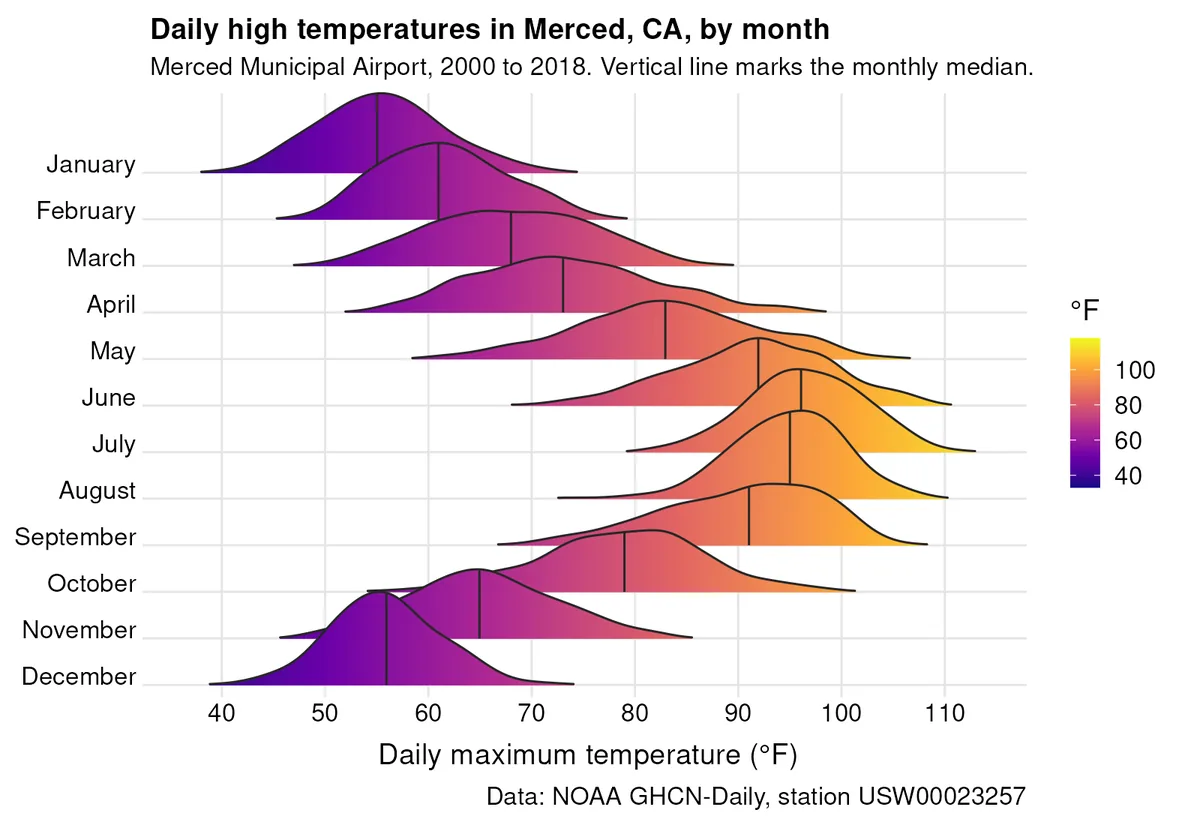
Now the version I actually wanted. geom_density_ridges_gradient() lets the fill change along the x-axis, so the color itself encodes temperature. You map fill to the computed x value with stat(x) and add a continuous scale. One limitation: the gradient geom can’t do transparency, so leave out alpha.
quantile_lines = TRUE draws vertical lines at quantiles of each group’s data. quantiles = 2 splits each distribution in half, which gives one line at the median. You can also pass specific probabilities, like quantiles = c(0.1, 0.5, 0.9).
p <- ggplot(merced, aes(x = tmax_f, y = month, fill = stat(x))) +
  geom_density_ridges_gradient(
    scale = 2,
    rel_min_height = 0.01,
    bandwidth = 2,
    quantile_lines = TRUE,
    quantiles = 2,
    colour = "grey15"
  ) +
  scale_fill_viridis_c(name = "\u00b0F", option = "C") +
  scale_x_continuous(breaks = seq(30, 120, by = 10), expand = c(0, 0)) +
  scale_y_discrete(expand = c(0.01, 0)) +
  coord_cartesian(clip = "off") +
  labs(
    title = "Daily high temperatures in Merced, CA, by month",
    subtitle = "Merced Municipal Airport, 2000 to 2018. Vertical line marks the monthly median.",
    x = "Daily maximum temperature (\u00b0F)",
    y = NULL,
    caption = "Data: NOAA GHCN-Daily, station USW00023257"
  ) +
  theme_ridges(grid = TRUE, center_axis_labels = TRUE) +
  theme(
    plot.background = element_rect(fill = "white", colour = NA),
    legend.position = "right"
  )

ggsave("ode-to-joy-plot.png", p, width = 8, height = 5.5, dpi = 200, bg = "white")
The theme tweaks, briefly:
theme_ridges()is the theme that ships with ggridges. It removes the gray panel, keeps light grid lines, and puts each y label level with its ridge’s baseline.center_axis_labels = TRUEcenters the axis titles.scale_y_discrete(expand = c(0.01, 0))removes most of the padding below the bottom ridge, andcoord_cartesian(clip = "off")keeps the top ridge from being clipped when it pokes above the panel.scale_x_continuous(expand = c(0, 0))lets the ridges run right up to the axis edges."\u00b0F"is the degree sign written as a Unicode escape, so the script works no matter what encoding your editor saves in. (In the first post I built degree labels withparse()and plotmath. This is less fiddly.)
What to look for: your plot should show the peaks moving right from January into the summer and back again toward December. The shape changes too, not just the location. Some months may have tight, tall ridges and others wide, flat ones, and some may lean to one side. The median line lets you compare centers without trusting your eye to find the peak, and the gradient fill makes the hot months stand out.
If you want quartile bands rather than a single line, the ggridges docs show a neat variant. Ask for the ECDF and fill by quantile instead of by x:
ggplot(merced, aes(x = tmax_f, y = month, fill = factor(stat(quantile)))) +
  stat_density_ridges(
    geom = "density_ridges_gradient",
    calc_ecdf = TRUE,
    quantiles = 4,
    quantile_lines = TRUE
  ) +
  scale_fill_viridis_d(name = "Quartile")
Ridgelines by year
The same idea works with years on the y-axis. Mixing all twelve months into one distribution per year just gives you a wide lump with the seasons mashed together, so I kept summer only (June to August). This makes it easy to spot hotter or cooler summers.
summer <- merced %>%
  filter(month(date) %in% 6:8) %>%
  mutate(year = factor(year))

ggplot(summer, aes(x = tmax_f, y = year)) +
  geom_density_ridges(
    scale = 1.5,
    rel_min_height = 0.01,
    quantile_lines = TRUE,
    quantiles = c(0.1, 0.5, 0.9),
    fill = "#CAA586",
    alpha = 0.8
  ) +
  labs(x = "Daily maximum temperature (\u00b0F), June to August", y = NULL) +
  theme_ridges()
The fill color is the same tan I used for the record-range bars in the Tufte chart, for a bit of continuity. Here 2000 is at the bottom and 2018 at the top, since the factor levels are in increasing order. Look for years whose median line sits clearly to the right or left of the rest, and for years with a long left tail (a run of unusually mild days) or a heavy right tail (heat waves). Each summer is only about 92 days, so don’t read too much into small wiggles.
Pitfalls
Bandwidth
Covered above, but it is the one that bites most often. If the plot looks spiky, the bandwidth is too small for your data or your data are rounded. If every group looks like the same bell curve, it is too big. Pick a value on purpose, write it in the code, and check one or two groups against a plain histogram:
merced %>%
  filter(month == "July") %>%
  ggplot(aes(x = tmax_f)) +
  geom_histogram(binwidth = 1)
Overlap hiding data
With a large scale, a tall ridge can cover the left half of the ridge above it. In the monthly plot, watch the months where neighboring distributions sit close together on the x-axis. If you think something is hidden, drop scale below 1 for a moment, or add the raw observations under each curve:
ggplot(merced, aes(x = tmax_f, y = month)) +
  geom_density_ridges(
    scale = 0.95,
    jittered_points = TRUE,
    position = position_points_jitter(width = 0.5, height = 0),
    point_size = 0.2,
    point_alpha = 0.2,
    alpha = 0.6
  )
With over 500 points per month this gets busy, but it shows how much data each curve is built on and whether a bump comes from a single odd week.
Factor order
ggridges draws the first factor level at the bottom. If you use month straight from factor(month.name[...], levels = month.name), January ends up at the bottom and December at the top, which reads upside down for a calendar. That is why I used fct_rev(). For groups with no natural order, sort by something meaningful (a median, say) instead of alphabetically. Even with ordered groups like years, sorting by median answers a different question:
summer %>%
  mutate(year = fct_reorder(year, tmax_f, .fun = median)) %>%
  ggplot(aes(x = tmax_f, y = year)) +
  geom_density_ridges(scale = 1.5, rel_min_height = 0.01)
Now the years run from coolest to hottest median summer high. That makes ranking easy, but you can no longer see trends over time, so choose based on the question you’re asking.
Character vs. factor
If y is a plain character vector, ggplot2 sorts it alphabetically, which for month names gives April, August, December, and so on. If your months come out in a strange order, check class() before anything else.
The code
The full script that downloads the data and makes the main figure is in this site’s repo at scripts/post_figures/ode-to-joy-plot.R. It needs readr, dplyr, lubridate, ggplot2, ggridges and forcats, and it writes ode-to-joy-plot.png to the working directory:
Rscript scripts/post_figures/ode-to-joy-plot.R
Next on the list is “Weather in Cloud”, where this same data goes to AWS in a Docker container.
← All writing