 Rohit Gupta
Am I going to be delayed? Predicting flight delays with machine learning
Most of this blog so far has been about Merced weather: a Tufte-style chart, a Shiny app, joy plots and moving the app to AWS, with one detour into web scraping. This one wanders a little further from home, but weather does show up again at the end. Every time I book a ticket I end up staring at two itineraries that cost the same and wondering which one is more likely to leave me sitting at a gate. The U.S. Bureau of Transportation Statistics (BTS) publishes every domestic flight operated by the larger U.S. airlines, with scheduled and actual times, so this seemed like a question the data could answer, or at least partly answer.
The weather posts were in R; this one is in Python, since I wanted pandas and scikit-learn for the modeling. Every number below is what I got from running this code on December 2018. Another month will give you different numbers, and December turns out to be a tricky month to test on.
Framing the question
“Will my flight be delayed?” sounds like one question, but the details decide whether the answer is useful or quietly cheating.
The target. BTS gives every flight an ArrDel15 flag: 1 if the flight arrived 15 or more minutes after its scheduled arrival time, 0 otherwise. That is the definition the airlines report against, so I use it as is. Arrival delay is what I care about as a passenger; a late departure that makes up time in the air doesn’t bother me much.
The features. I only want to use what I’d know when I’m booking the ticket:
- the airline (
Reporting_Airline) - origin and destination airports (
Origin,Dest) - day of the week (
DayOfWeek) - scheduled departure hour, from
CRSDepTime(“CRS” is the airlines’ reservation system, so these are the scheduled times) - distance (
Distance)
Month belongs on this list too, but with only one month of data it is a constant. To learn anything about seasons you need a couple of years.
What I leave out. The file has about 110 columns, and lots of them are recorded after the fact: DepTime, DepDelay, TaxiOut, WheelsOff, ArrTime, and the delay-cause columns (CarrierDelay, WeatherDelay, NASDelay, LateAircraftDelay). Any of these would make the model look brilliant, because a flight that left 40 minutes late almost always arrives late. That is leakage. It answers “will a flight that is already late arrive late”, which nobody needs a model for.
Cancellations and diversions. A cancelled flight never arrives, so ArrDel15 is empty for it, and the same goes for diverted flights. I have to make a call here, and my call is to drop them. In December 2018 that removes 6,752 cancelled flights (1.14%) and 1,353 diverted ones (0.23%). The cost is that my model answers a narrower question: given that the flight operates normally, will it land 15+ minutes late? For a passenger a cancellation is the worst delay of all, so if you care about those, model “cancelled” as its own target or fold it into a “bad outcome” label. Just don’t let the missing values vanish without noticing.
Getting the data
The data comes from the Reporting Carrier On-Time Performance table at transtats.bts.gov. You can pick columns through the web form, but there are also prezipped monthly files with every column, and those are easier to script:
curl -O "https://transtats.bts.gov/PREZIP/On_Time_Reporting_Carrier_On_Time_Performance_1987_present_2018_12.zip"
unzip -l On_Time_Reporting_Carrier_On_Time_Performance_1987_present_2018_12.zip
For December 2018 the zip is about 30 MB, and it unpacks to a 270 MB CSV plus a readme.html that describes the fields. Because the zip holds two files, I open it with zipfile and hand pandas the CSV, reading only the ten columns I need. That keeps memory sane and skips the empty trailing column the CSV has (every line ends with a comma).
import os
import urllib.request
import zipfile

import numpy as np
import pandas as pd

URL = ("https://transtats.bts.gov/PREZIP/"
       "On_Time_Reporting_Carrier_On_Time_Performance_1987_present_{}_{}.zip")
COLS = ["FlightDate", "DayOfWeek", "Reporting_Airline", "Origin", "Dest",
        "CRSDepTime", "Distance", "ArrDel15", "Cancelled", "Diverted"]


def download(year, month, folder="bts_data"):
    os.makedirs(folder, exist_ok=True)
    path = os.path.join(folder, "{}_{}.zip".format(year, month))
    if not os.path.exists(path):
        urllib.request.urlretrieve(URL.format(year, month), path)
    return path


def load_month(path):
    with zipfile.ZipFile(path) as z:
        csv_name = [n for n in z.namelist() if n.endswith(".csv")][0]
        with z.open(csv_name) as f:
            return pd.read_csv(f, usecols=COLS)


flights = load_month(download(2018, 12))

# clean up types
flights["FlightDate"] = pd.to_datetime(flights["FlightDate"])
# CRSDepTime is local time as HHMM; pandas reads "0810" as the integer 810
flights["dep_hour"] = (flights["CRSDepTime"] // 100) % 24

# drop cancelled and diverted flights (ArrDel15 is missing for them)
flown = flights[(flights["Cancelled"] == 0) & (flights["Diverted"] == 0)].copy()
flown["delayed"] = flown["ArrDel15"].astype(int)
for col in ["Reporting_Airline", "Origin", "Dest"]:
    flown[col] = flown[col].astype("category")

# time-based split: first 20 days to train, last 11 days to test
cutoff = pd.Timestamp("2018-12-21")
train = flown[flown["FlightDate"] < cutoff]
test = flown[flown["FlightDate"] >= cutoff]
y_train = train["delayed"].values
y_test = test["delayed"].values

print(len(flights), len(flown), len(train), len(test))
print(y_train.mean(), y_test.mean())
A few notes on the cleaning:
- The HHMM times.
CRSDepTimeis quoted in the CSV as"0810", but pandas reads it as the integer810, so the leading zero is gone. Integer division by 100 gives the hour either way. The% 24folds a2400into hour 0, just in case; December 2018 doesn’t have any (its values run from 3 to 2359). These are local times at the origin airport, which is what you want for “do evening flights run late”. - Categoricals. Airline and airport codes become pandas categoricals. That saves memory, and later it gives me a fixed set of categories to encode against.
- Counts. December 2018 has 593,842 flights, 585,737 after the exclusions, across 17 reporting airlines and 346 airports.
Split by time, not by row
The usual train_test_split shuffles rows, and for this problem that is the wrong default. Flights on the same day share weather, airport congestion, and aircraft that bounce between cities. If a storm hits Chicago one afternoon, a random split puts some of that day’s O’Hare flights in training and the rest in test, and the model gets to “predict” the test flights using what their neighbors did. In real life you are always predicting a day the model has never seen.
So I train on December 1 to 20 (377,877 flights) and test on December 21 to 31 (207,860 flights). This also exposes something a random split would hide: the test period is different. The delay rate in training is 16.0%, and in the test days it is 23.3%. Holiday traffic and a few very bad days (more than a third of flights arrived late on December 21, 27 and 28), made the last third of December much worse than the first two thirds. That is the kind of shift a model meets when it is actually used, and you would rather find it now.
For comparison I fit the same logistic regression (below) on a random split of the same month. It scored a ROC AUC of 0.668, against 0.643 on the time split. That gap is the optimism you would have reported without noticing.
Baselines first
Before fitting anything fancy I want two numbers to beat.
The first is the dumbest model: predict the training delay rate (16.0%) for every flight. Its ROC AUC is 0.5 by definition, since it can’t rank anything, and its PR AUC equals the test delay rate, 0.233. It is also a reminder about class imbalance: on the test days, calling every flight “on time” is right 76.7% of the time, and it tells you nothing. That is why I don’t report accuracy anywhere in this post.
The second baseline uses one feature that everybody who flies already suspects matters: the scheduled departure hour. Delays pile up through the day, because a late inbound aircraft makes the next flight late, and that one makes the one after it late too.
# Schematic: continues from the loading block above (needs train, test, y_train, y_test)
from sklearn.metrics import average_precision_score, roc_auc_score


def report(name, y_true, p):
    print("{:<22} ROC AUC {:.3f}   PR AUC {:.3f}".format(
        name, roc_auc_score(y_true, p), average_precision_score(y_true, p)))


p_const = np.full(len(test), y_train.mean())
report("constant", y_test, p_const)

rate_by_hour = train.groupby("dep_hour")["delayed"].mean()
p_hour = test["dep_hour"].map(rate_by_hour).fillna(y_train.mean()).values
report("hour of day", y_test, p_hour)
The hour-of-day lookup table gets a ROC AUC of 0.592 and a PR AUC of 0.281. Across the whole month, about 10% of 5 a.m. departures arrived late, rising fairly steadily to about 25% for the 6 p.m. departures before easing off a little late at night (the left panel of the figure further down). If you only remember one thing from this post, book the early flight. That isn’t news, but now there is a number on it.
Logistic regression with one-hot features
Next, all the booking-time features in a logistic regression. Airline, airports, day of week and hour are one-hot encoded; distance is standardized. handle_unknown="ignore" matters here: with a time split, an airport might appear in the test days but not in training, and without that flag transform raises an error.
# Schematic: continues from the blocks above (needs train, test, y_train, y_test, report)
from sklearn.compose import ColumnTransformer
from sklearn.linear_model import LogisticRegression
from sklearn.pipeline import make_pipeline
from sklearn.preprocessing import OneHotEncoder, StandardScaler

cat_cols = ["Reporting_Airline", "Origin", "Dest", "DayOfWeek", "dep_hour"]
num_cols = ["Distance"]

preprocess = ColumnTransformer([
    ("cat", OneHotEncoder(handle_unknown="ignore"), cat_cols),
    ("num", StandardScaler(), num_cols),
])
logreg = make_pipeline(preprocess,
                       LogisticRegression(C=1.0, solver="lbfgs", max_iter=1000))

logreg.fit(train[cat_cols + num_cols], y_train)
p_logreg = logreg.predict_proba(test[cat_cols + num_cols])[:, 1]
report("logistic regression", y_test, p_logreg)
The one-hot matrix has about 740 columns but is sparse, and the fit took about 7 seconds for me. I set solver="lbfgs" explicitly because scikit-learn 0.20 warns that the default solver is about to change, and spelling it out gives the same behavior on old and new versions. ROC AUC 0.643, PR AUC 0.334: a clear step up from the hour-of-day table, though still far from a sure thing.
A tree ensemble
Logistic regression adds effects up. It can learn that evenings are bad and that some airport is bad, but not that evenings at that airport are especially bad. Tree ensembles learn interactions like that on their own, so I tried scikit-learn’s GradientBoostingClassifier. (The upcoming 0.21 release adds a much faster HistGradientBoostingClassifier, but it is marked experimental, so I’m sticking with the established one for now.)
Two practical choices:
- Encoding. Trees don’t need one-hot columns, and
GradientBoostingClassifieris slow on 740 of them, so I give each airline and airport an integer code taken from the training categories. Anything unseen in training gets-1. The order of the codes is arbitrary (alphabetical), which isn’t ideal, but with enough splits the trees can still pick out individual airports. - Subsampling. Gradient boosting fits its trees one after another, so it doesn’t parallelize the way a random forest does. I fit it on a random 150,000 of the 377,877 training flights, which took about a minute. The full training set works too if you are willing to wait.
# Schematic: continues from the blocks above (needs train, test, y_train, y_test, report)
from sklearn.ensemble import GradientBoostingClassifier


def to_codes(df, reference):
    """Integer codes for the categorical columns, using the training categories.

    Airports or airlines never seen in training get -1.
    """
    out = pd.DataFrame(index=df.index)
    for col in ["Reporting_Airline", "Origin", "Dest"]:
        cats = reference[col].cat.categories
        out[col] = pd.Categorical(df[col], categories=cats).codes
    for col in ["DayOfWeek", "dep_hour", "Distance"]:
        out[col] = df[col].values
    return out


X_train_codes = to_codes(train, train)
X_test_codes = to_codes(test, train)

rng = np.random.RandomState(42)
idx = rng.choice(len(train), size=min(150000, len(train)), replace=False)

gbm = GradientBoostingClassifier(n_estimators=200, max_depth=5,
                                 learning_rate=0.1, subsample=0.8,
                                 random_state=42)
gbm.fit(X_train_codes.iloc[idx], y_train[idx])
p_gbm = gbm.predict_proba(X_test_codes)[:, 1]
report("gradient boosting", y_test, p_gbm)

for name, imp in sorted(zip(X_train_codes.columns, gbm.feature_importances_),
                        key=lambda x: -x[1]):
    print("{:<18} {:.3f}".format(name, imp))
Here is everything side by side, on the test days (December 21 to 31, 2018):
model                  ROC AUC   PR AUC
constant (16.0%)        0.500     0.233
hour of day             0.592     0.281
logistic regression     0.643     0.334
gradient boosting       0.646     0.346
On this slice of data the boosted trees beat logistic regression, but only just. I wouldn’t read much into a 0.003 difference in ROC AUC from one month and one split. The PR AUC gap is a little larger, which suggests the trees are better at picking out the small group of flights that are very likely to be late.
The feature importances are worth a skeptical look. DayOfWeek came out on top (0.205), ahead of destination, airline and hour (all around 0.18). I don’t believe weekday is the strongest signal in flight delays. With 20 training days, each weekday shows up only about three times, so “Thursday” mostly means “December 6, 13 and 20”, and December 20 happened to be a terrible day (31% of flights late). The model learned that particular Thursdays were bad, not that Thursdays are bad. One more reason to use more than a month of data. Also keep in mind that impurity-based importances favor features with many possible split points, so treat them as a rough hint at best.
Calibration: are the probabilities believable?
For a passenger, the ranking is only half the story. When the model says 30%, I’d like that to mean roughly 3 in 10 such flights arrive late. A reliability curve checks this: group flights by predicted probability, then compare the average prediction in each group with the fraction that were actually late. A well-calibrated model sits on the diagonal.
scikit-learn has sklearn.calibration.calibration_curve for this. I wrote a ten-line version instead so I could drop bins with very few flights, since a bin of 40 flights jumps around so much that it hides the pattern. The block below draws both panels of the figure: delay rate by departure hour over the whole month, and the reliability curves on the test days.
# Schematic: continues from the blocks above (needs flown, y_test, p_logreg, p_gbm)
import matplotlib.pyplot as plt


def reliability(y_true, p, width=0.05, min_count=500):
    """Mean predicted vs observed delay rate in probability bins."""
    which = np.floor(p / width).astype(int)
    mean_pred, frac_pos = [], []
    for b in np.unique(which):
        in_bin = which == b
        if in_bin.sum() >= min_count:
            mean_pred.append(p[in_bin].mean())
            frac_pos.append(y_true[in_bin].mean())
    return np.array(mean_pred), np.array(frac_pos)


by_hour = flown.groupby("dep_hour")["delayed"].agg(["mean", "size"])
by_hour = by_hour[by_hour["size"] >= 2000]  # drop the sparse overnight hours

fig, (ax1, ax2) = plt.subplots(1, 2, figsize=(8, 5), dpi=200,
                               gridspec_kw={"width_ratios": [1.5, 1]})
ax1.bar(by_hour.index, by_hour["mean"] * 100, width=0.8, color="#2a78d6")
ax1.axhline(flown["delayed"].mean() * 100, color="#52514e", lw=1, ls="--")
ax1.set_xlabel("Scheduled departure hour (local time)")
ax1.set_ylabel("Flights arriving 15+ min late (%)")
ax1.set_title("Delay rate by departure hour, Dec 2018", loc="left")

for p, label, color in [(p_logreg, "Logistic regression", "#2a78d6"),
                        (p_gbm, "Gradient boosting", "#eb6834")]:
    mean_pred, frac_pos = reliability(y_test, p)
    ax2.plot(mean_pred, frac_pos, "o-", color=color, lw=2, ms=4, label=label)
ax2.plot([0, 1], [0, 1], color="#52514e", lw=1, ls="--")
ax2.set_xlim(0, 0.6)
ax2.set_ylim(0, 0.6)
ax2.set_xlabel("Predicted probability of delay")
ax2.set_ylabel("Observed delay rate")
ax2.set_title("Reliability on test days (Dec 21-31)", loc="left")
ax2.legend(frameon=False)

fig.tight_layout()
fig.savefig("am-i-going-to-be-delayed.png", dpi=200, facecolor="white")
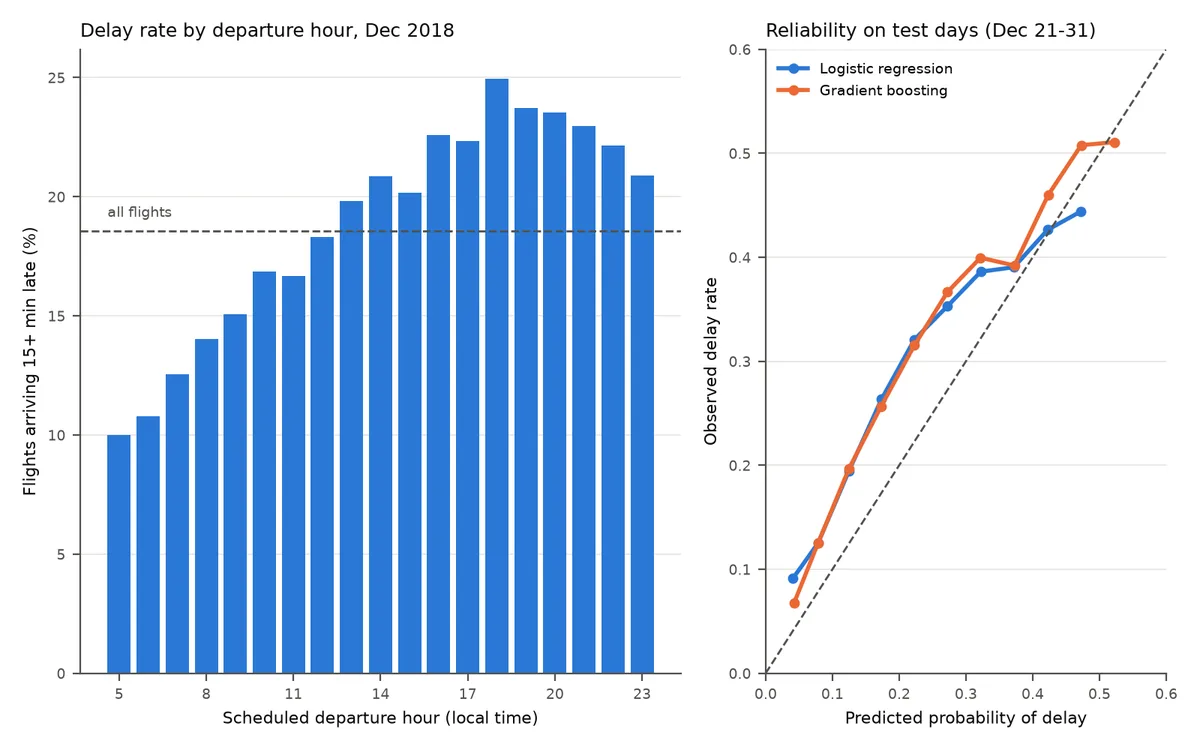
Both curves sit above the diagonal over most of the range. Flights the models gave 12% turned out late about 20% of the time, and flights they gave 22% were late about 32% of the time. On average both models predicted 16% while 23.3% of test flights were actually late. That isn’t a bug in either model. They learned the delay rate of early December and were tested on the holiday weeks. The ranking held up reasonably well (the curves still go up and to the right), but the absolute probabilities were too optimistic.
This is the main thing the time split taught me. With a random split, the training and test delay rates match by construction, so this gap can’t show up, and I’d have walked away thinking the probabilities were trustworthy. If I were building this for real, I would train on at least a full year so that late December appears in training, add month and some holiday flags, and recalibrate on a recent window (scikit-learn’s CalibratedClassifierCV can do that, with a held-out set from the most recent days rather than random folds).
Picking a threshold
A probability is what I actually want, but sometimes you need a yes/no answer, say for an app that shows a warning icon. The default cutoff of 0.5 is a poor fit here: with a base rate around 16 to 23%, the model rarely gets that confident. These are the gradient boosting results on the test days (precision is the share of flagged flights that were actually late, recall is the share of late flights that got flagged):
threshold   flagged   precision   recall
  0.2        25.5%      0.359      0.393
  0.3         7.1%      0.425      0.130
  0.4         2.2%      0.488      0.046
  0.5         0.6%      0.518      0.012
At 0.5 the model flags 0.6% of flights and catches about 1% of the late ones, so it is technically right when it speaks but almost never speaks. At 0.2 it flags a quarter of flights and catches about 40% of the delays, and 36% of the warnings are right, compared with 23% for a random guess. Where to set the cutoff depends on what a false alarm costs you. For me, a false alarm costs nothing (I pick the other itinerary), so a low threshold is fine.
A common fix for class imbalance is class_weight="balanced" or oversampling the delayed flights. That pushes the predicted probabilities up, which wrecks calibration, and usually does much less for the ranking. If you want more flights flagged, lowering the threshold gets you there directly, and the probabilities still mean what they say.
What the model can’t know
Even with perfect tuning, a booking-time model is capped by what happens after you book:
- Weather. The bad days in the test set (December 21, 27 and 28) were not bad because they were Fridays and Thursdays. A model built on schedule information has no way to see a storm coming three weeks out.
- Late-arriving aircraft. In December 2018, 40% of the delay minutes that BTS attributes to a cause went to
LateAircraftDelay: the plane you are waiting for is late from its previous leg. (Only 5% wereWeatherDelay, but that category covers only extreme weather; ordinary bad weather mostly ends up underNASDelay, the air traffic system, at 23%.) That is known on the day, a few hours ahead, not at booking time. Including it would be leakage for this question, but it would be a perfectly legitimate feature for a “should I leave for the airport yet” model. - Holidays and volume. One month cannot teach a model what Christmas week looks like. A few years of data can.
The natural next step, and the one that ties back to the Merced weather posts, is to join NOAA weather. The GHCN-Daily data I used for the joy plots has stations at most large airports, so the join is by origin airport and date. Roughly:
# Schematic: sketch of a weather join; ghcn_daily and airport_to_station are not built in this post
weather = ghcn_daily.merge(airport_to_station, on="station_id")  # adds an Origin column
weather = weather[["Origin", "date", "PRCP", "SNOW", "AWND", "TMIN"]]
flown = flown.merge(weather, left_on=["Origin", "FlightDate"],
                    right_on=["Origin", "date"], how="left")
Two warnings. Mapping airport codes to station IDs takes some manual work. And observed weather on the day of the flight is not booking-time information: a model that uses it tells you how much of the delay was weather, but it can’t help you choose a ticket. For that you’d need archived weather forecasts, which are much harder to find.
What I took away
On December 2018, booking-time features got me from a ROC AUC of 0.59 (departure hour alone) to about 0.65 (all features, either model), and the two models were almost tied. The probabilities were too low on the holiday weeks, by about 7 percentage points on average, which I would only have noticed because I split by date. The practical advice the data supports is the same advice frequent flyers give: take the morning flight. Delay rates went from about 10% for 5 a.m. departures to about 25% for 6 p.m. ones, and that was the biggest single signal I found.
The full script, which downloads the data, prints every number quoted above and draws the figure, is in this site’s repository at scripts/post_figures/am-i-going-to-be-delayed.py. It runs in a few minutes on a laptop. To try another month, change the download(2018, 12) call and the split date; to use several months, call load_month in a loop and pd.concat the results. I’m going to do that with all of 2018 next, with a test set of the last two months, which should settle whether the weekday effect is real.